Bramble Estate Branding
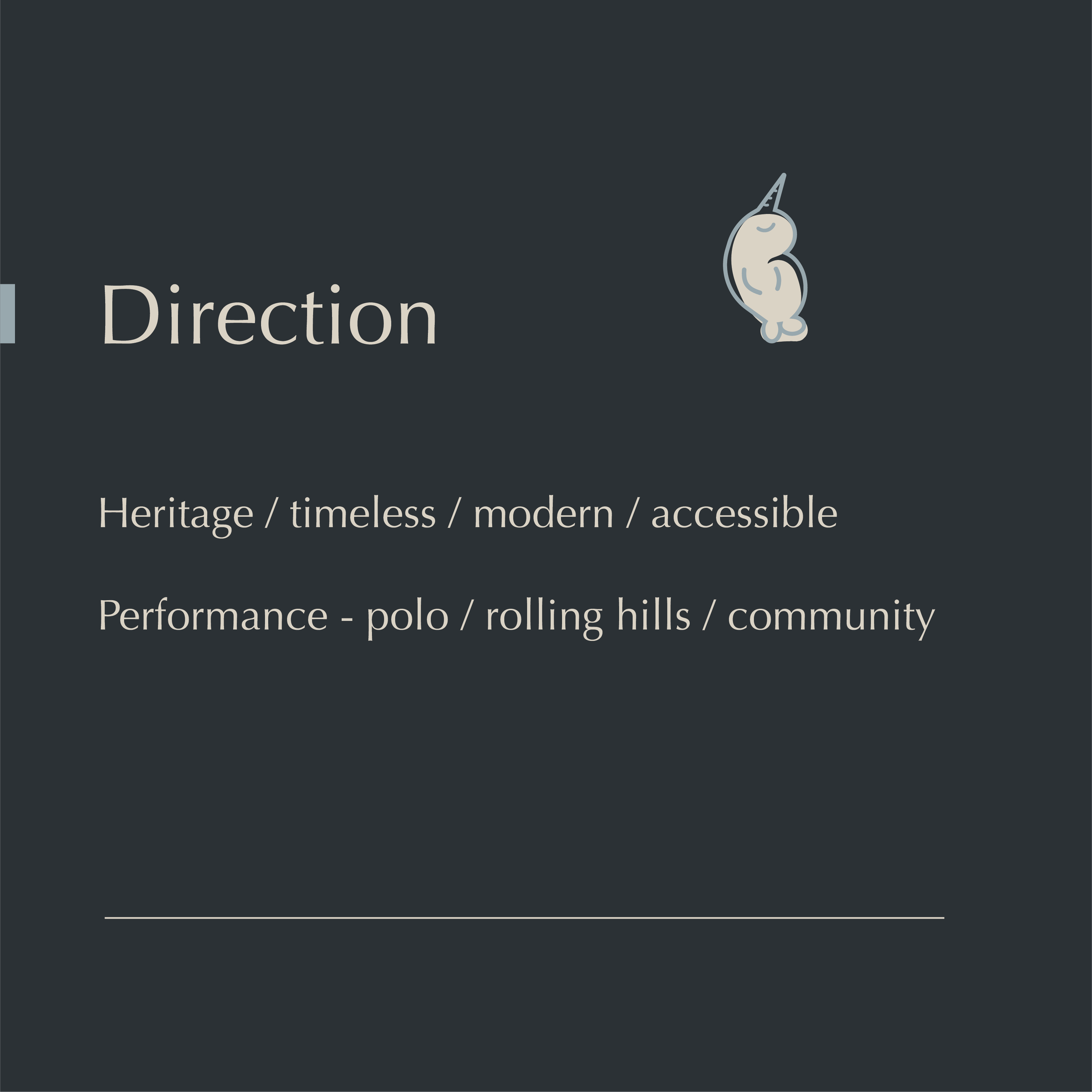
Elevating Bramble Estates’ branding to honour its long-standing heritage and world-class polo, set amongst rolling hills and a close-knit community.
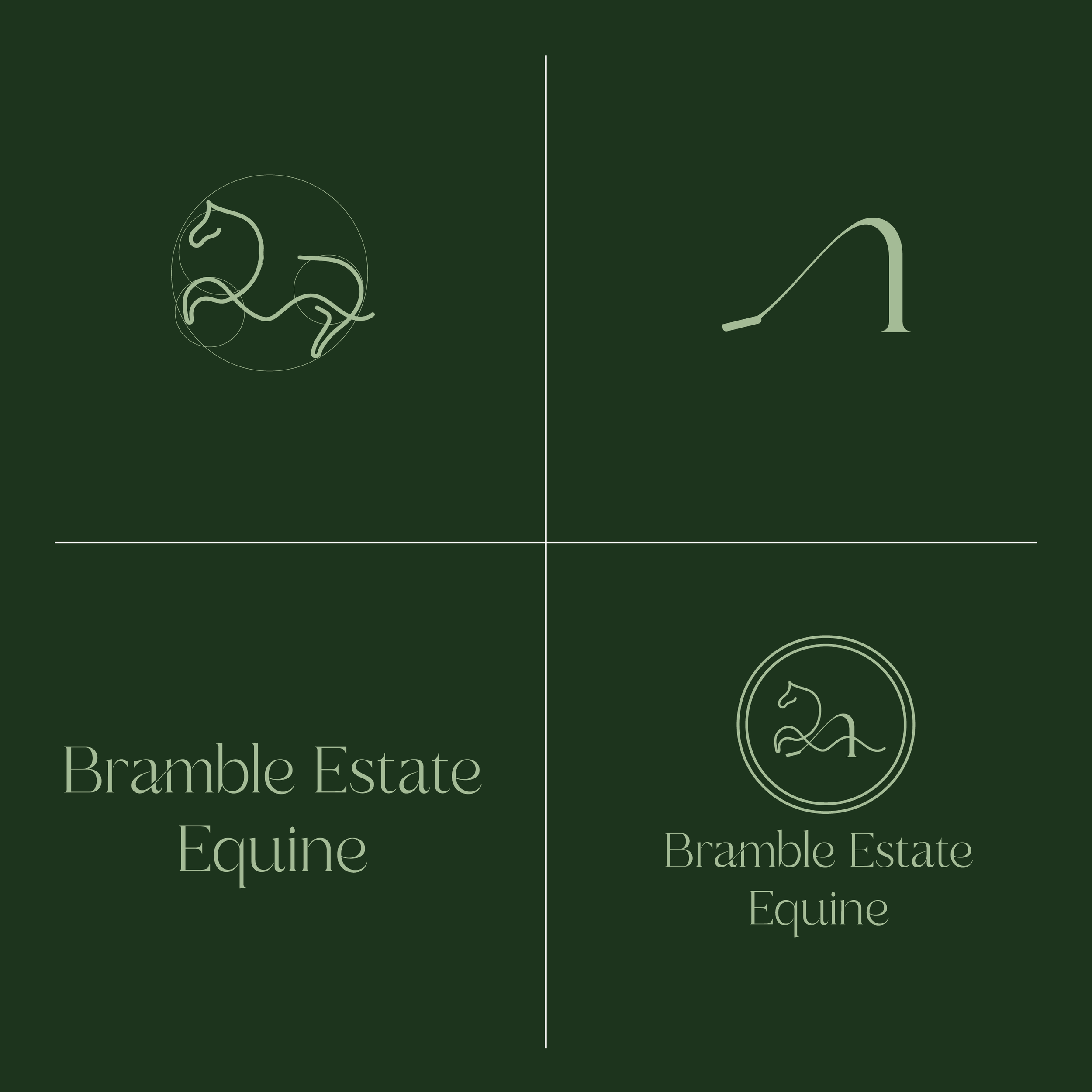
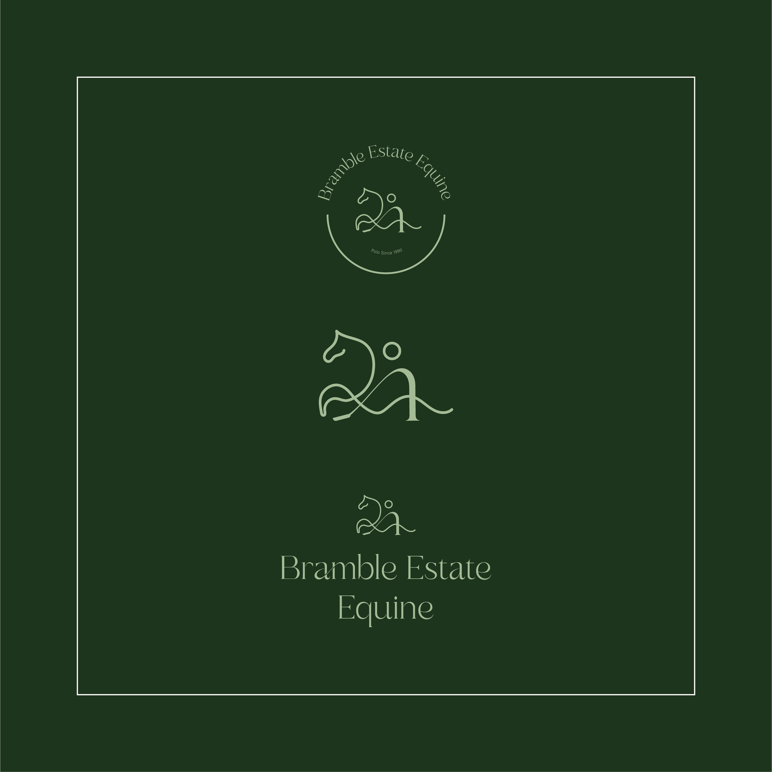
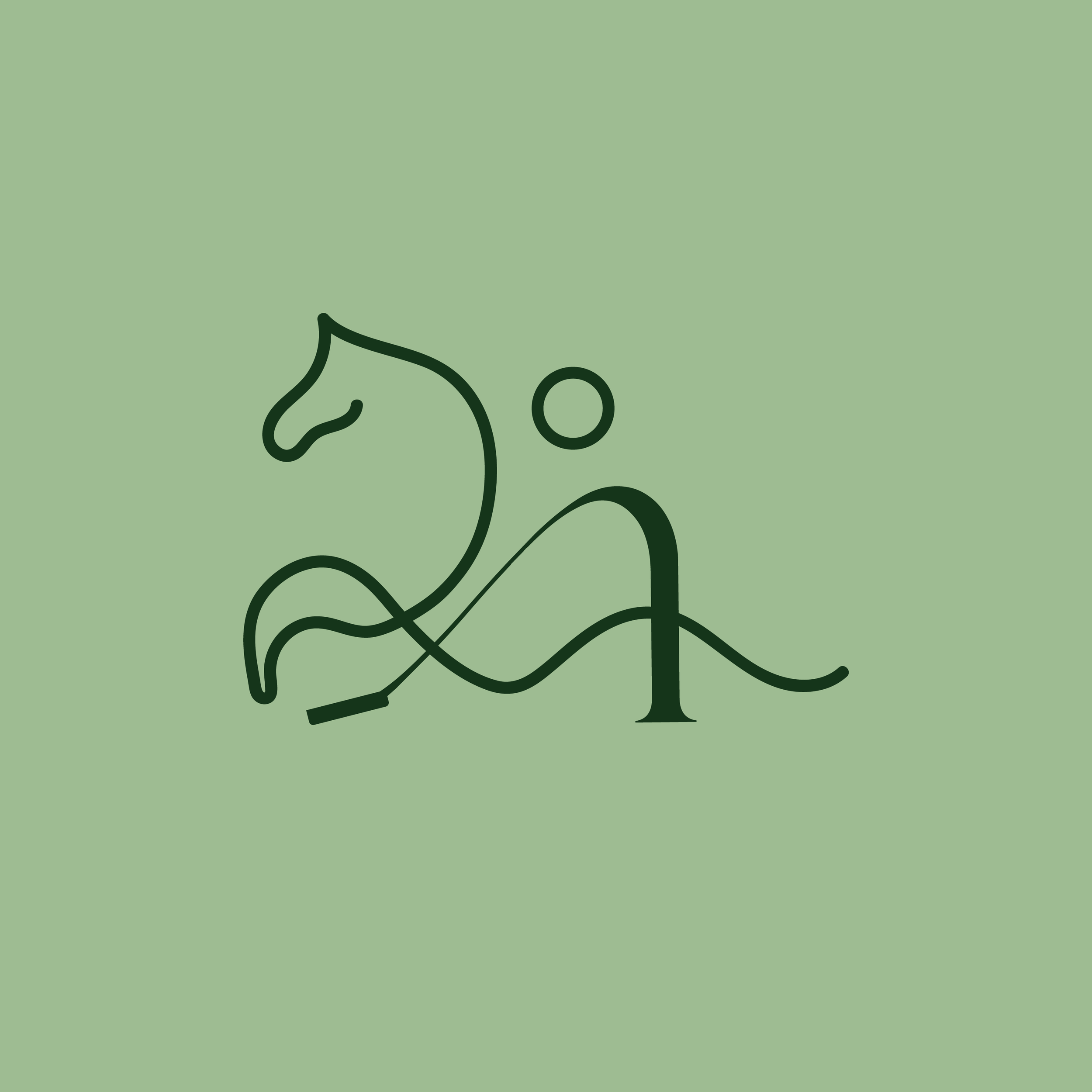
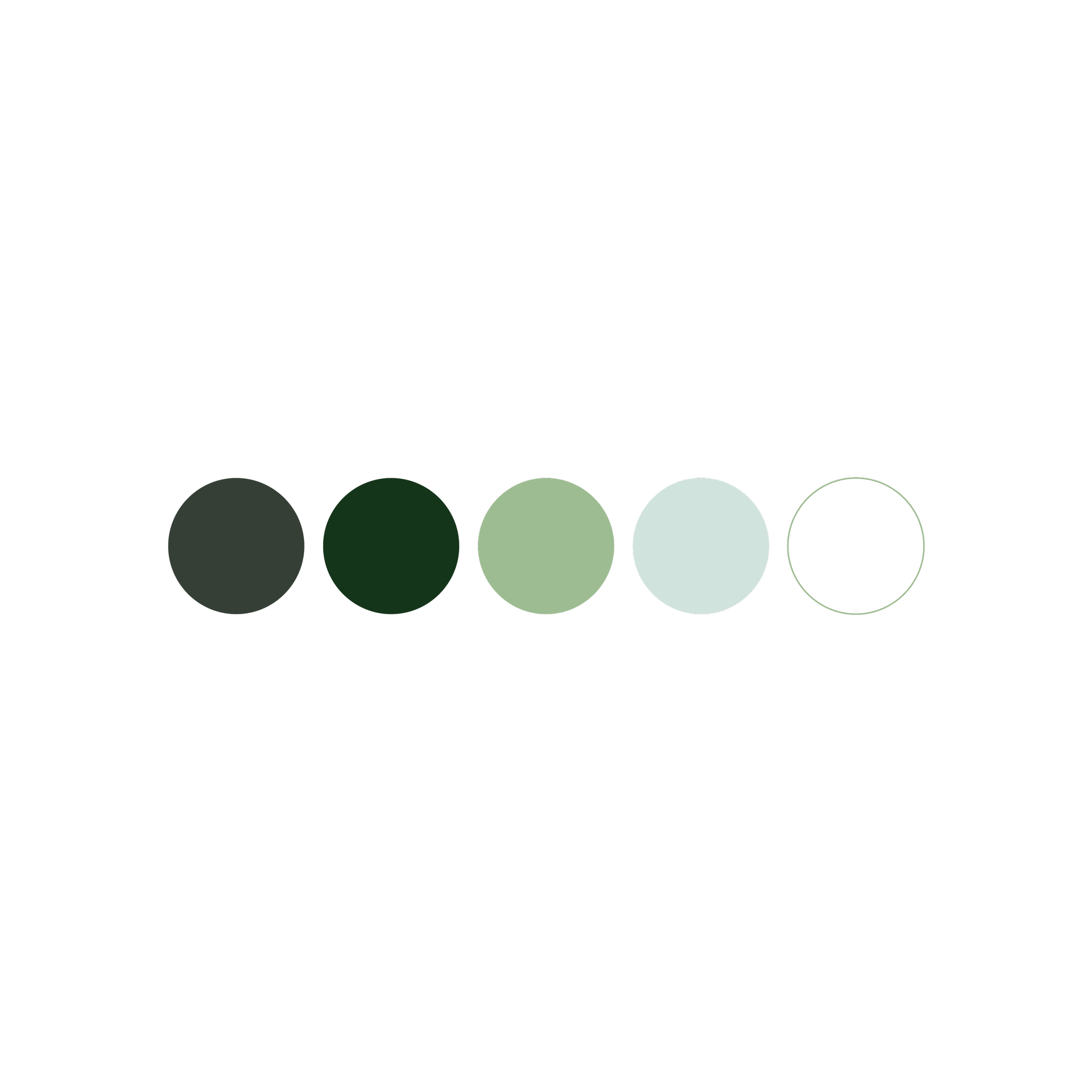
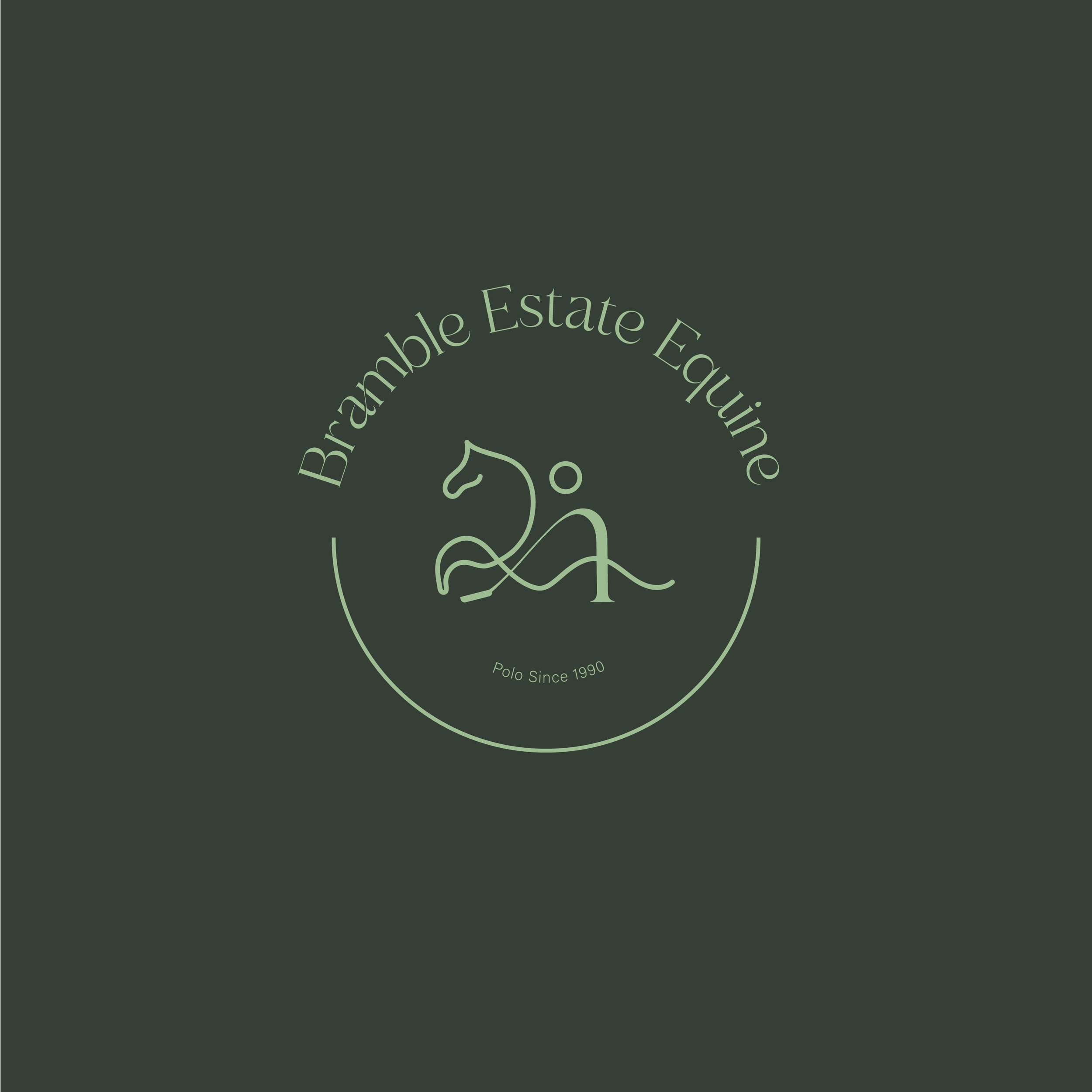
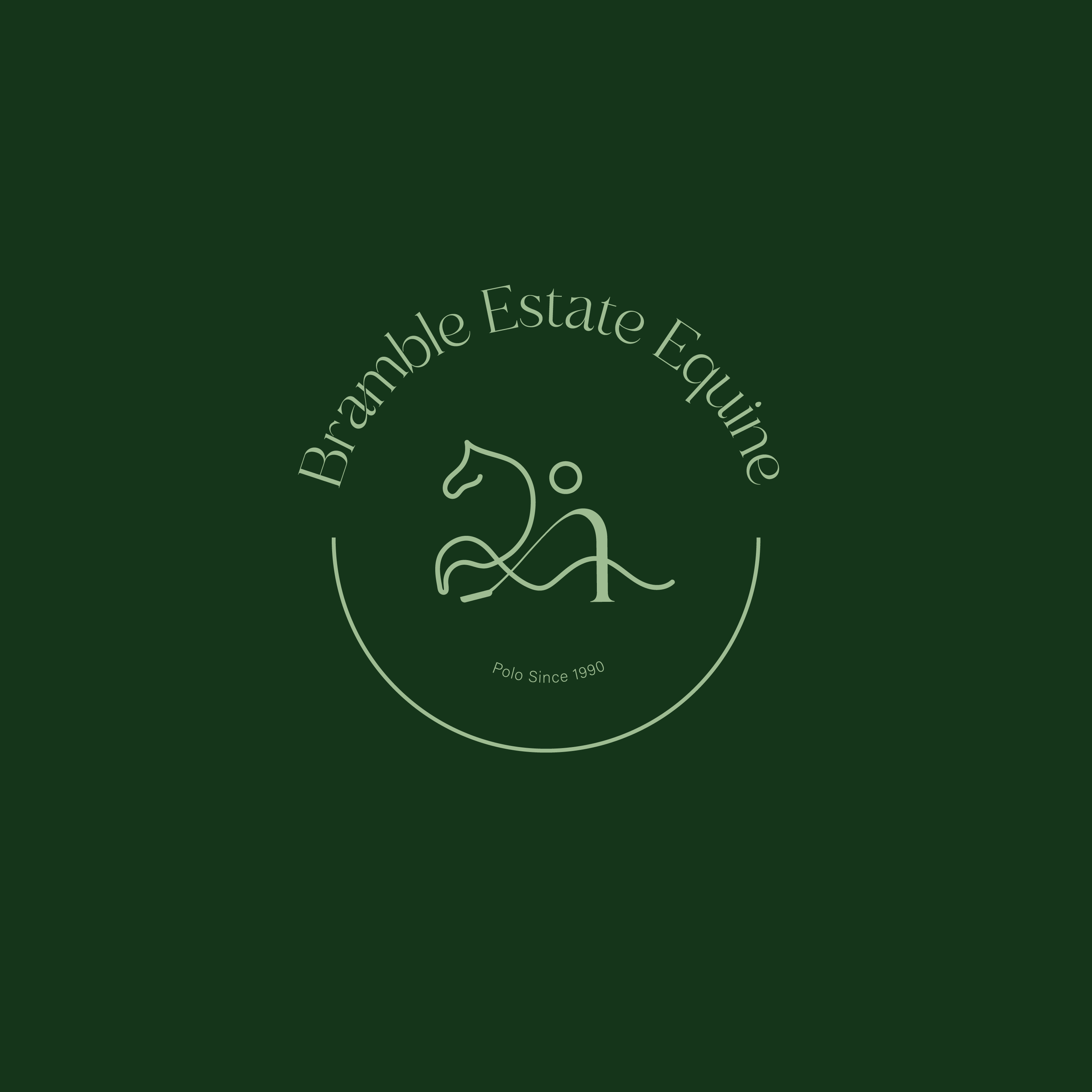
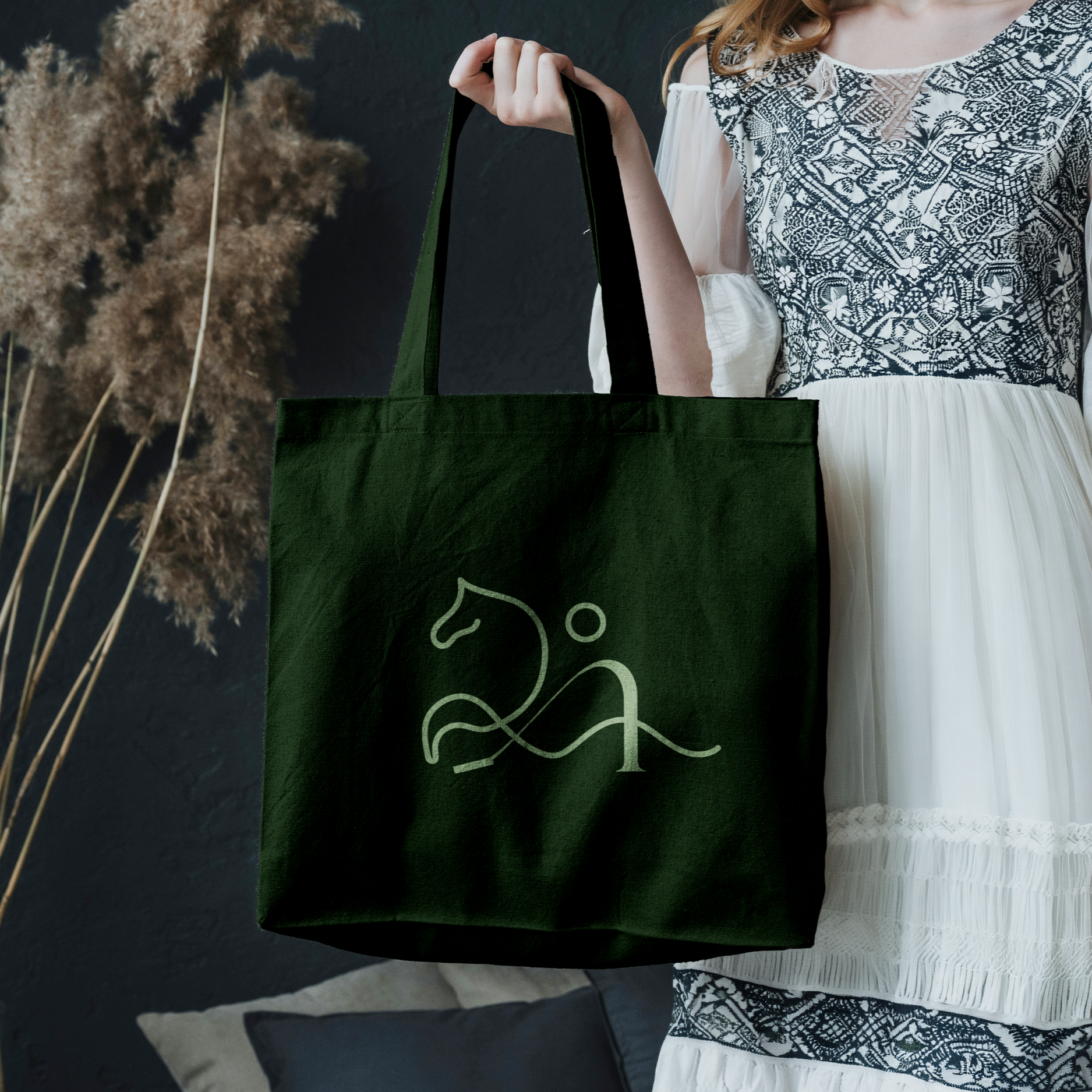
The logo draws proudly from the sport of polo, hand-drawn in a fluid motion that echoes the surrounding landscape. The green palettes reinforce this connection to the land, while a clean, contemporary execution brings the brand confidently into the present. The result is an identity that feels both timeless and forward-looking.
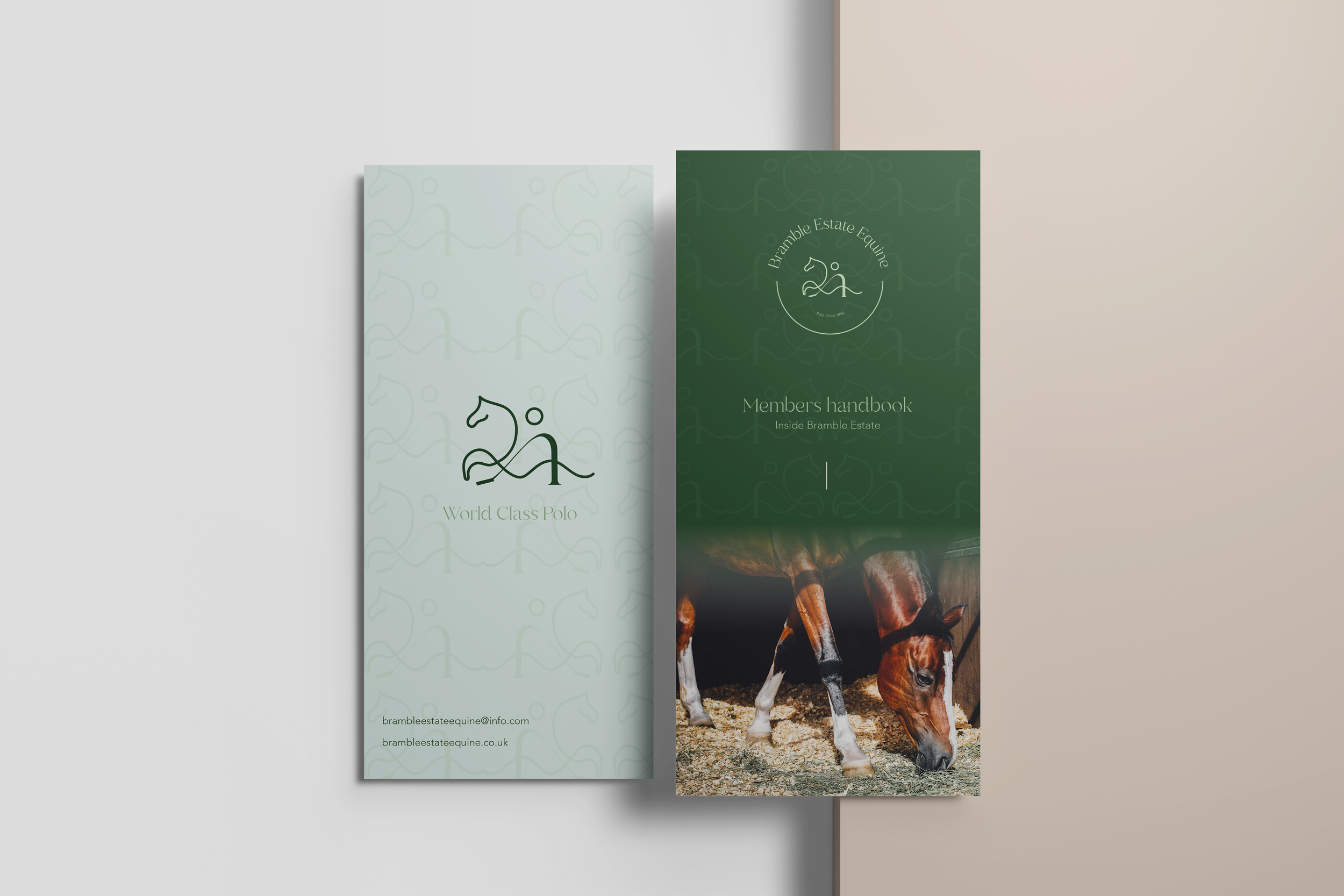
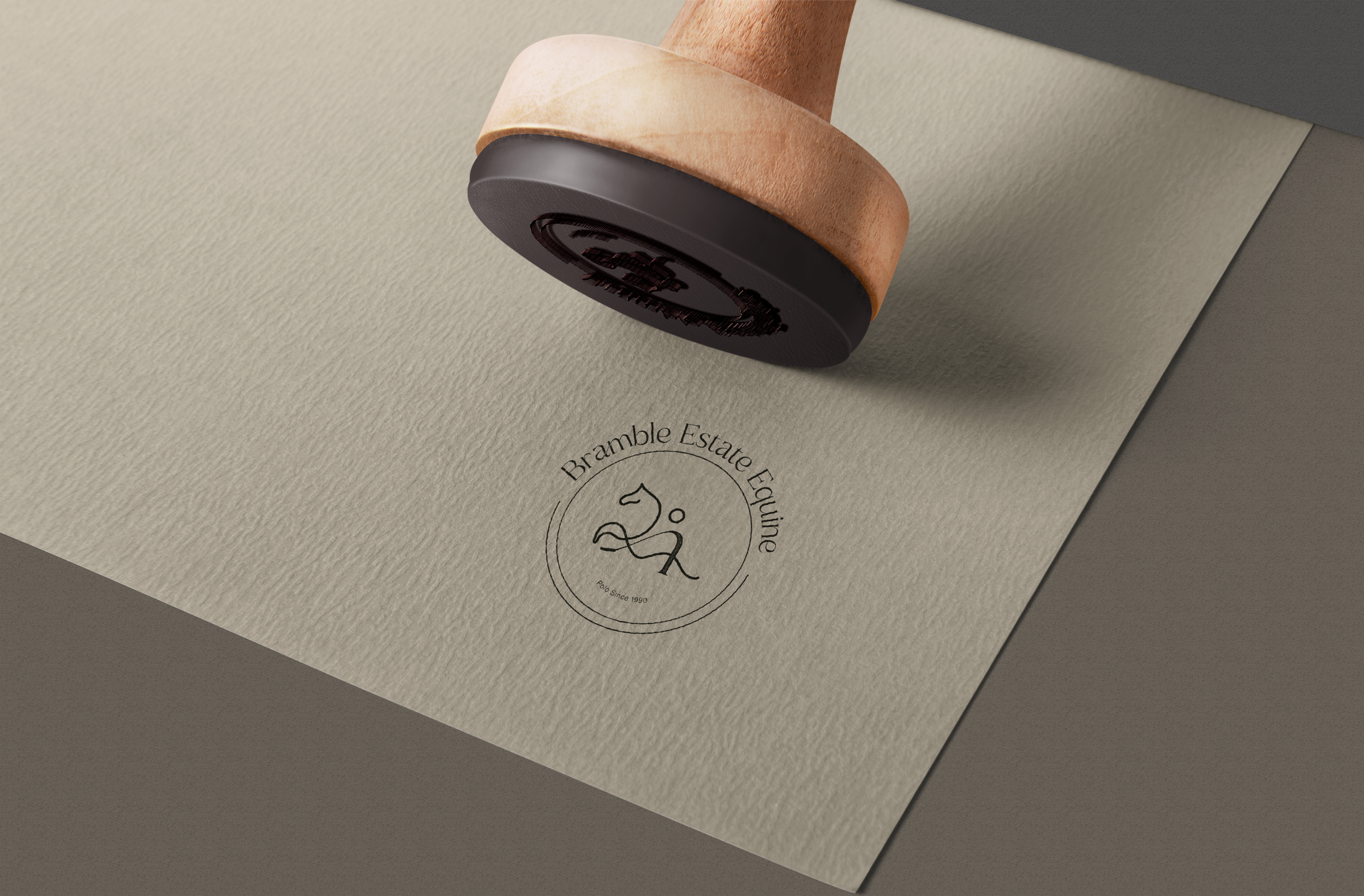
Logo variations were developed to ensure flexibility across a wide range of touchpoints, maintaining consistency while adapting seamlessly to different applications.
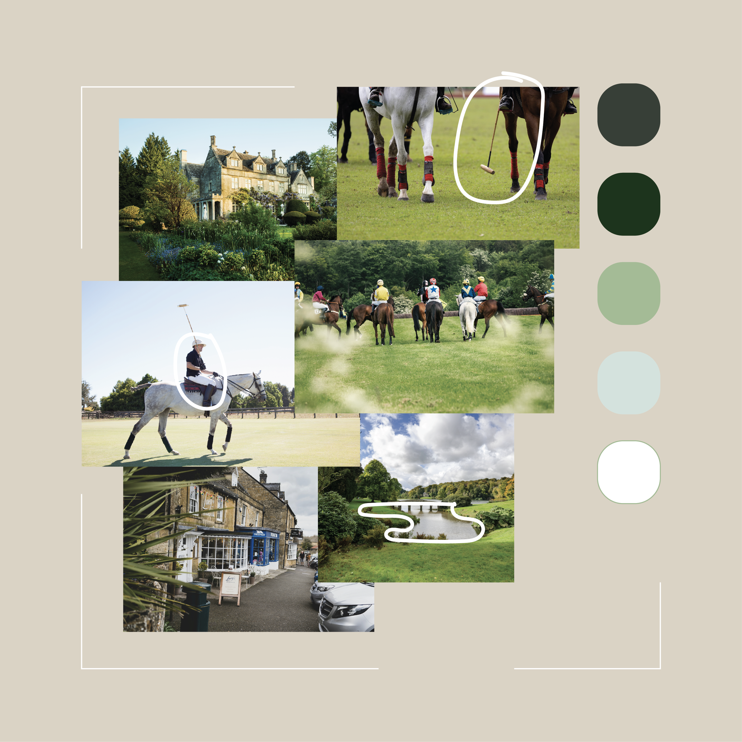
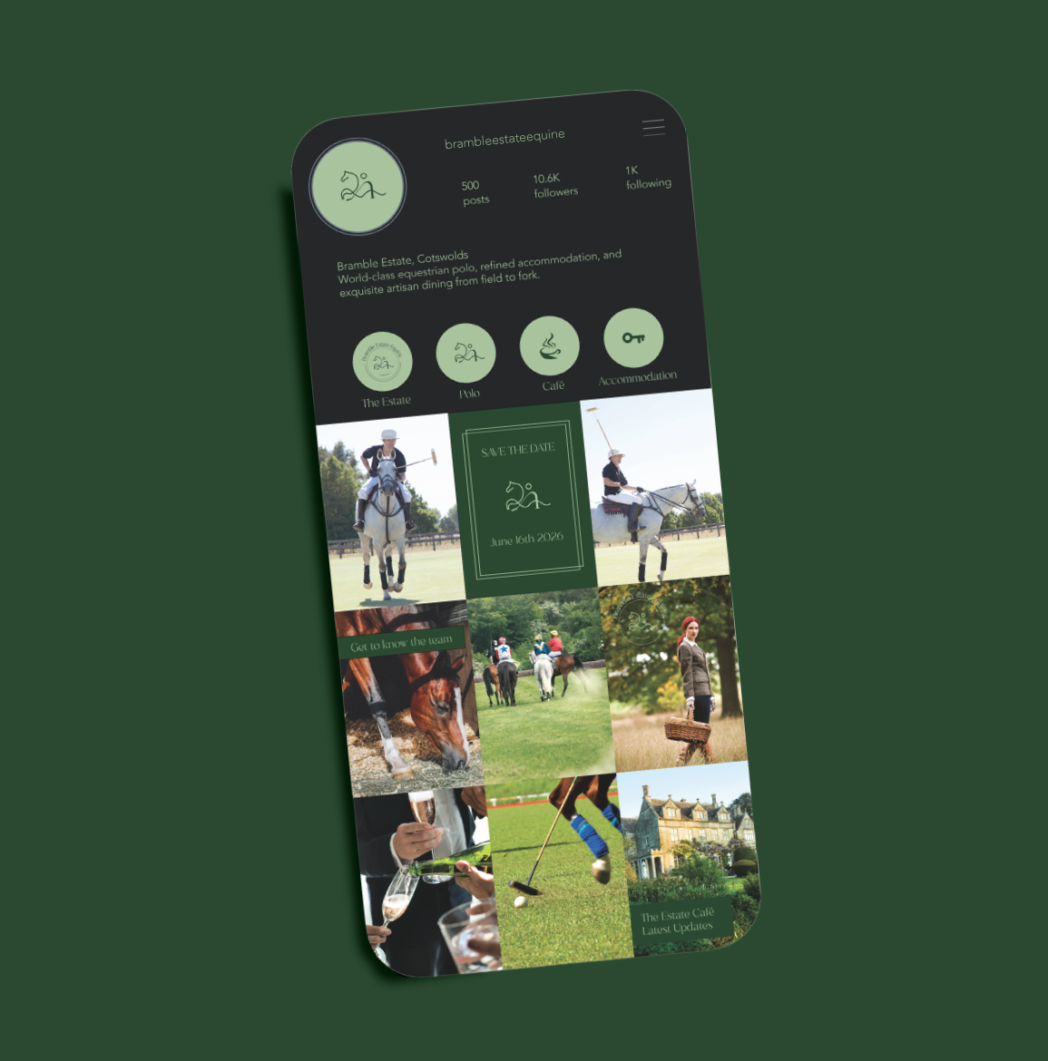
Social imagery captures a refined yet relaxed lifestyle, blending understated luxury with a cottagecore sensibility. Content showcases the surrounding landscapes and heritage sites, alongside the sport of polo, horse stables and a strong emphasis on equine welfare. It also highlights ‘things to do’ within the estate, from the café to the artisan food shop.
The local community remains central, with a focus on independent shops and nearby activities, reinforcing a sense of place and connection.
The photography style is natural, clean and bright, led by soft light and a palette of fresh green tones to reflect the estate’s setting.