
Project Dryft
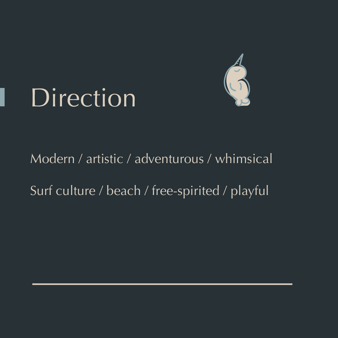
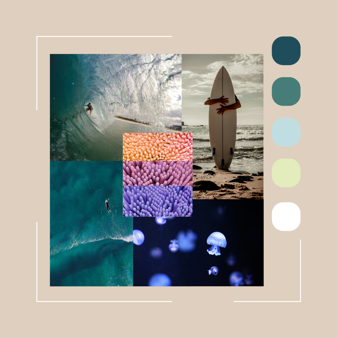
Created a brand identity for Dryft, a surf shop that reflects a grounded, adventurous and artistic spirit, inviting beginners, experienced surfers, adults and children alike to connect with the joy of surf culture.
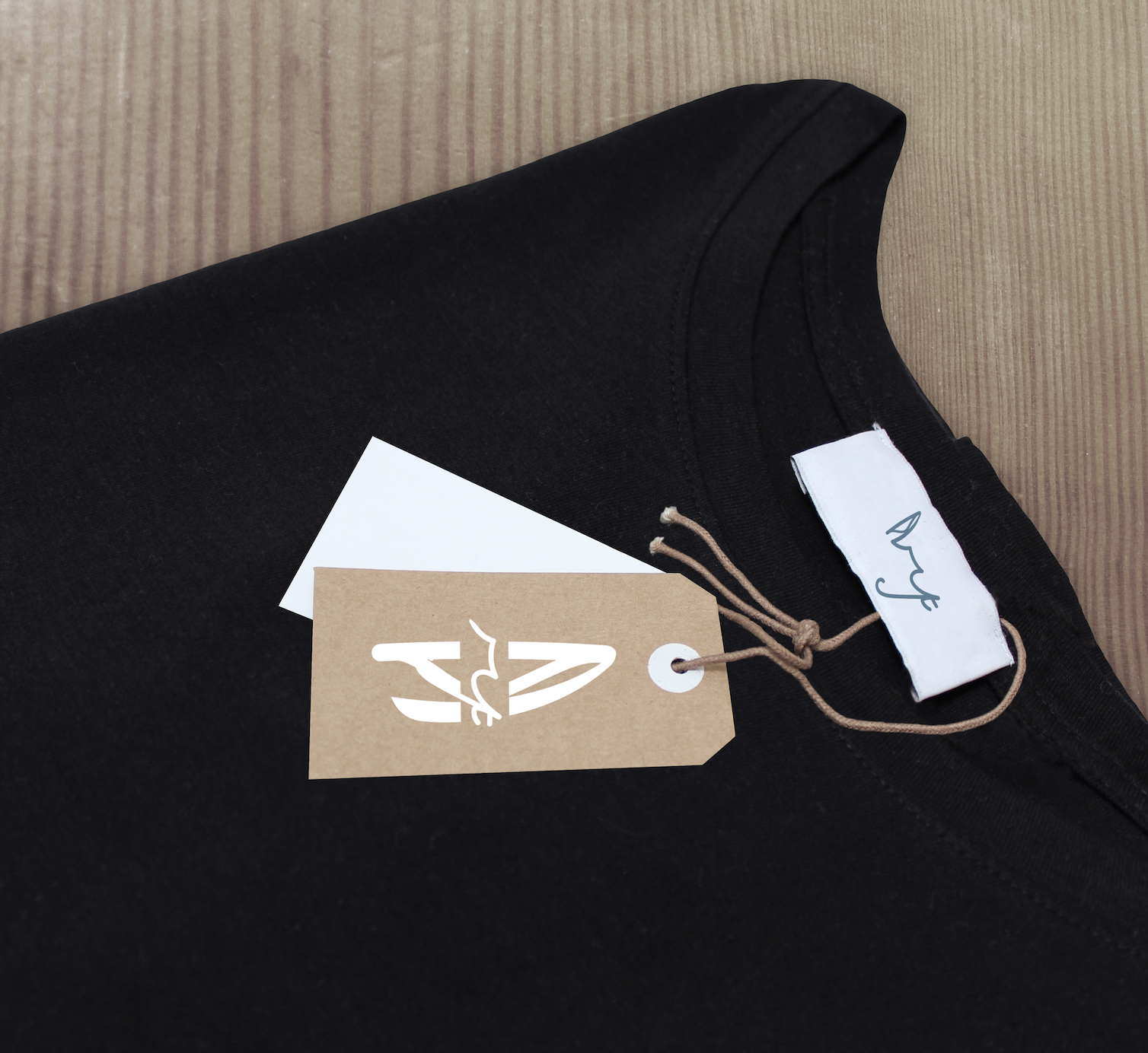
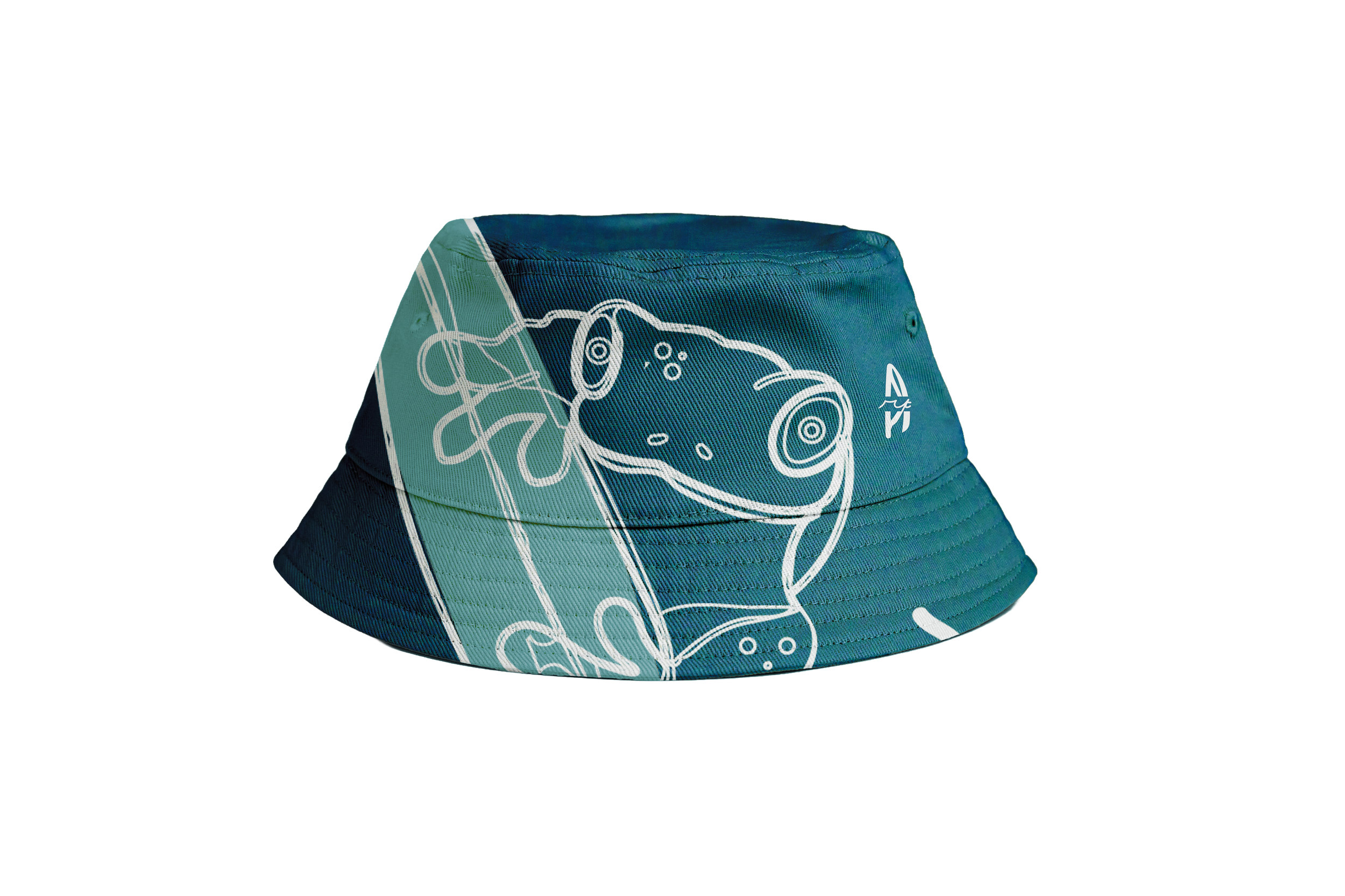
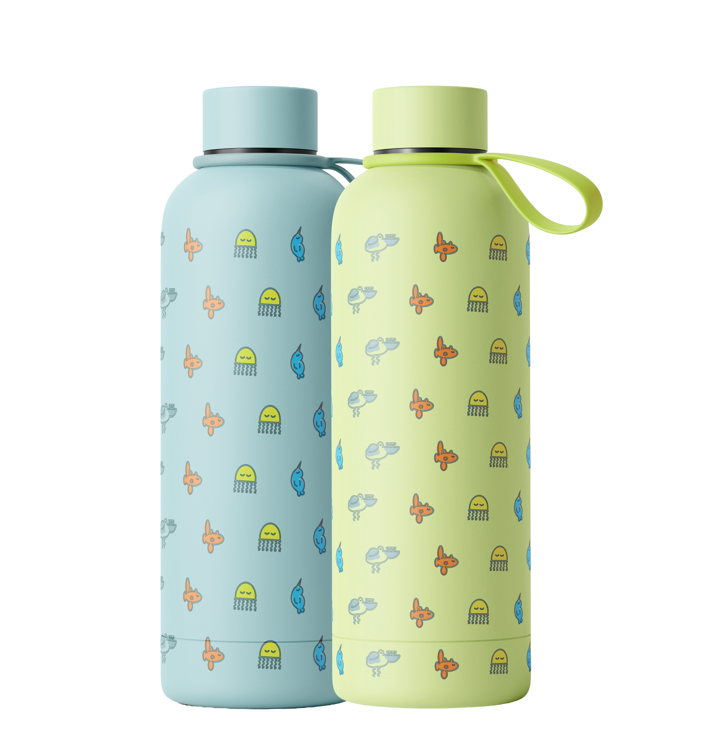
Touchpoints - brand identity systems, illustrations, apparel design, and pattern design.
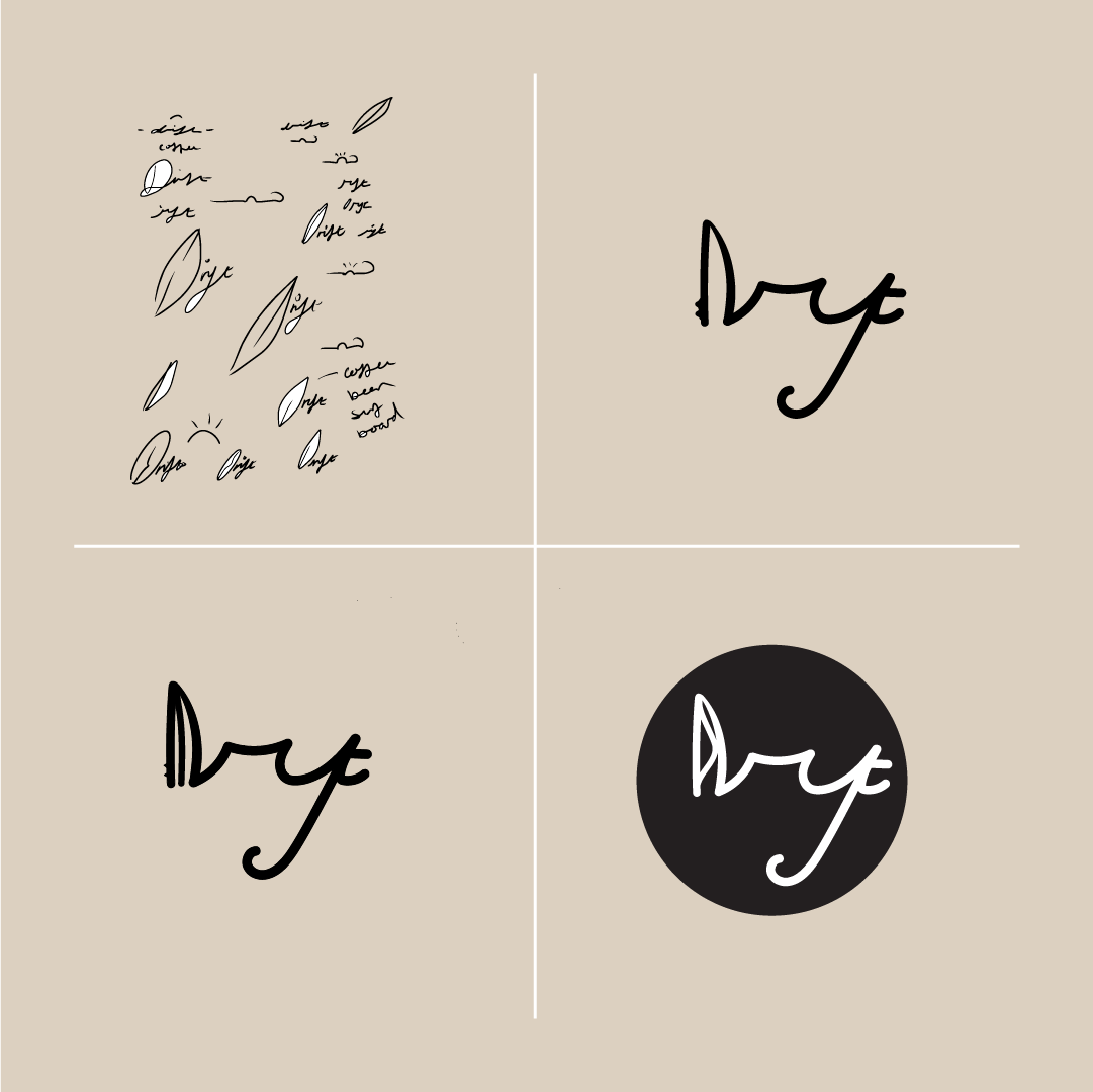
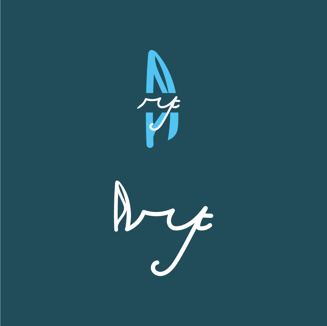
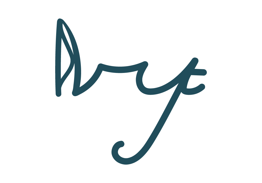
The wordmark is hand-drawn in a flowing style, reflecting the company name, Drift, and echoing the movement of the ocean. The ‘D’ is shaped like a surfboard, immediately positioning the brand within surf culture. Logo variations support UX needs, allowing both portrait and horizontal applications.
The hand-drawn frog illustration serves as a distinctive identity mark, reinforcing the brand’s whimsical, approachable, and adventurous surf culture.
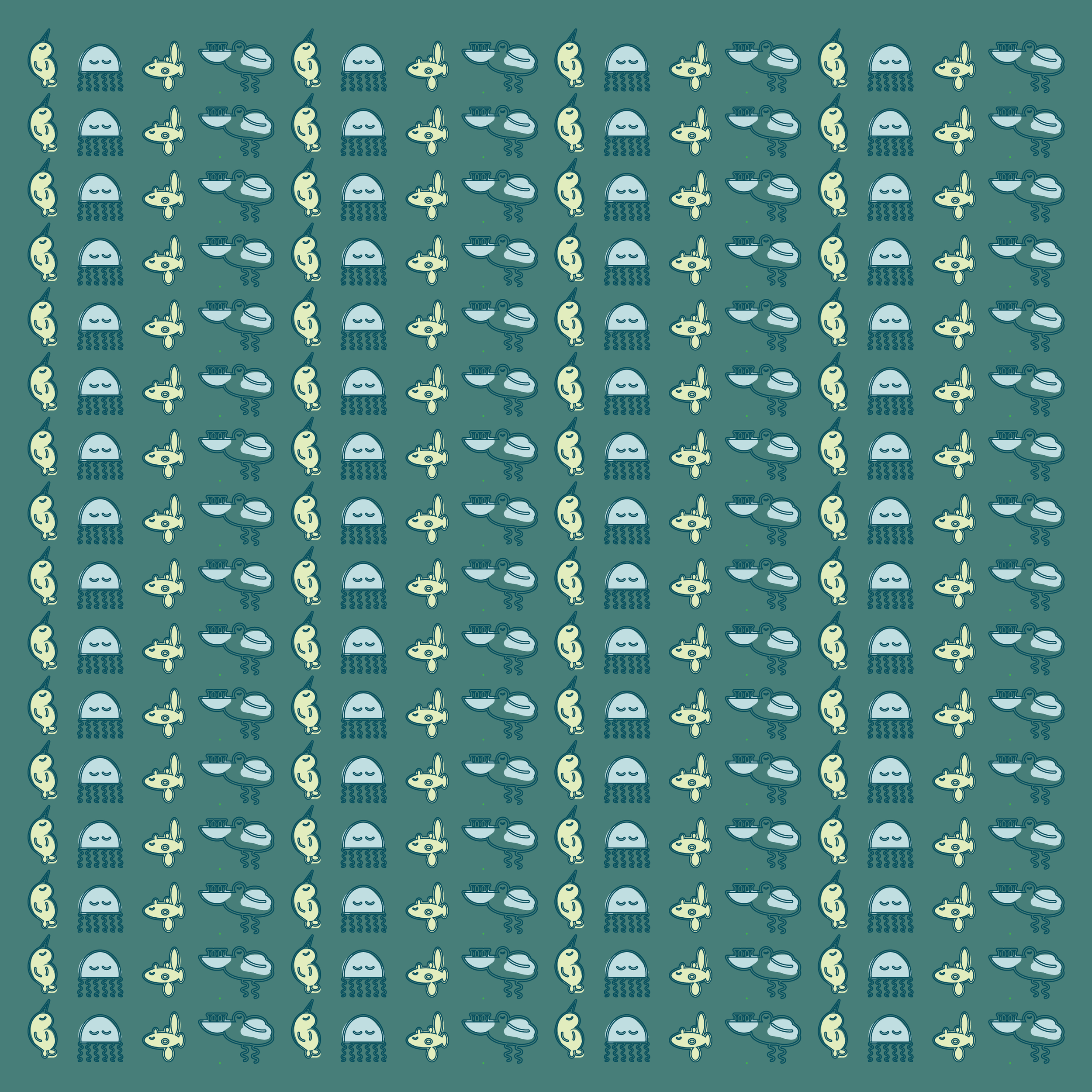
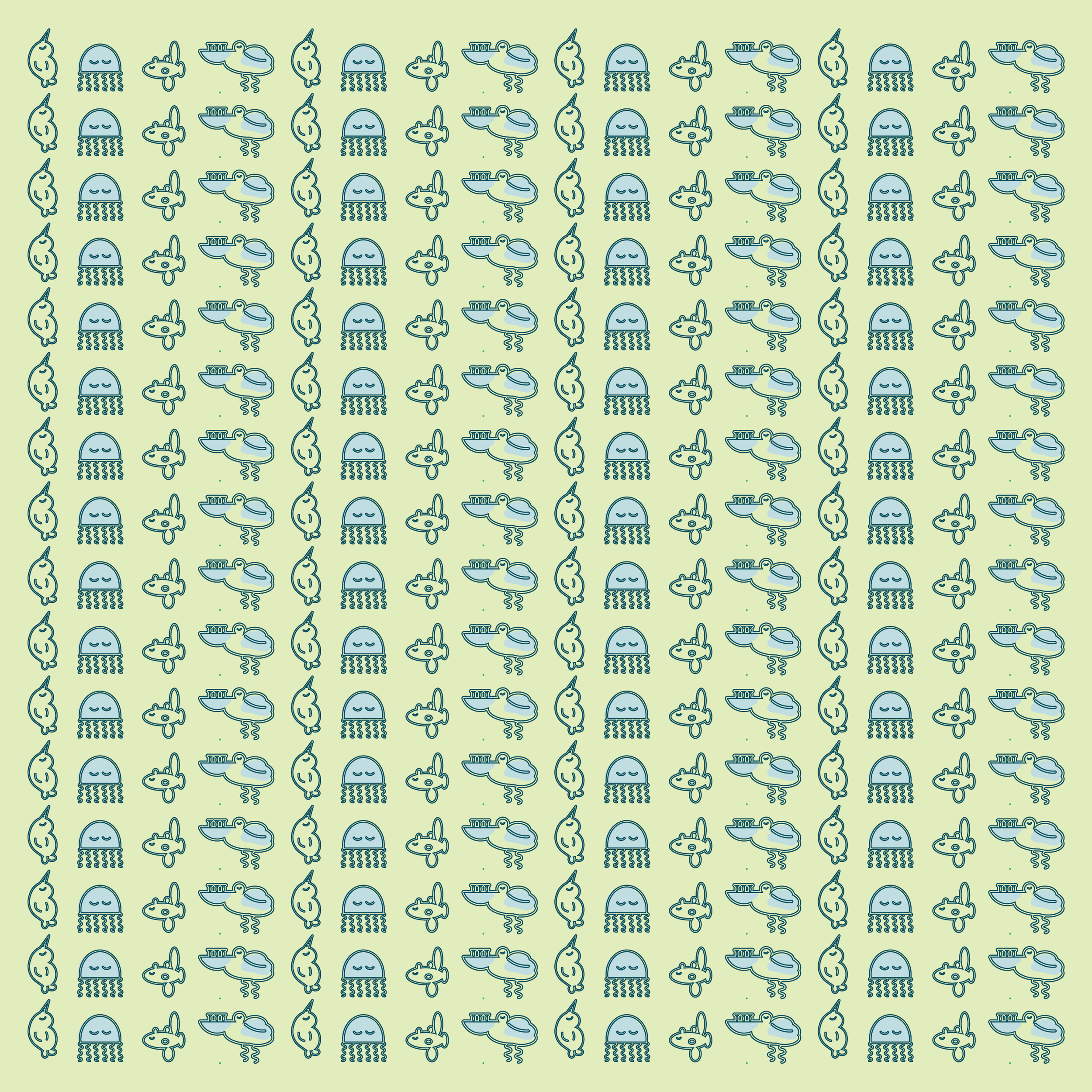
Children’s illustrations are also playful, but the design is more minimal with their own colour variations, making them suitable for patterns and products aimed at young audiences.
Created for portfolio purposes only.